In The Dry is a manufacturer’s representative for Sika roofing and waterproofing products. With an in-depth knowledge of Sika roofing and waterproofing products, In The Dry can help clients find the right product for their project, whether they are an architect, project manager, contractor, or building owner.
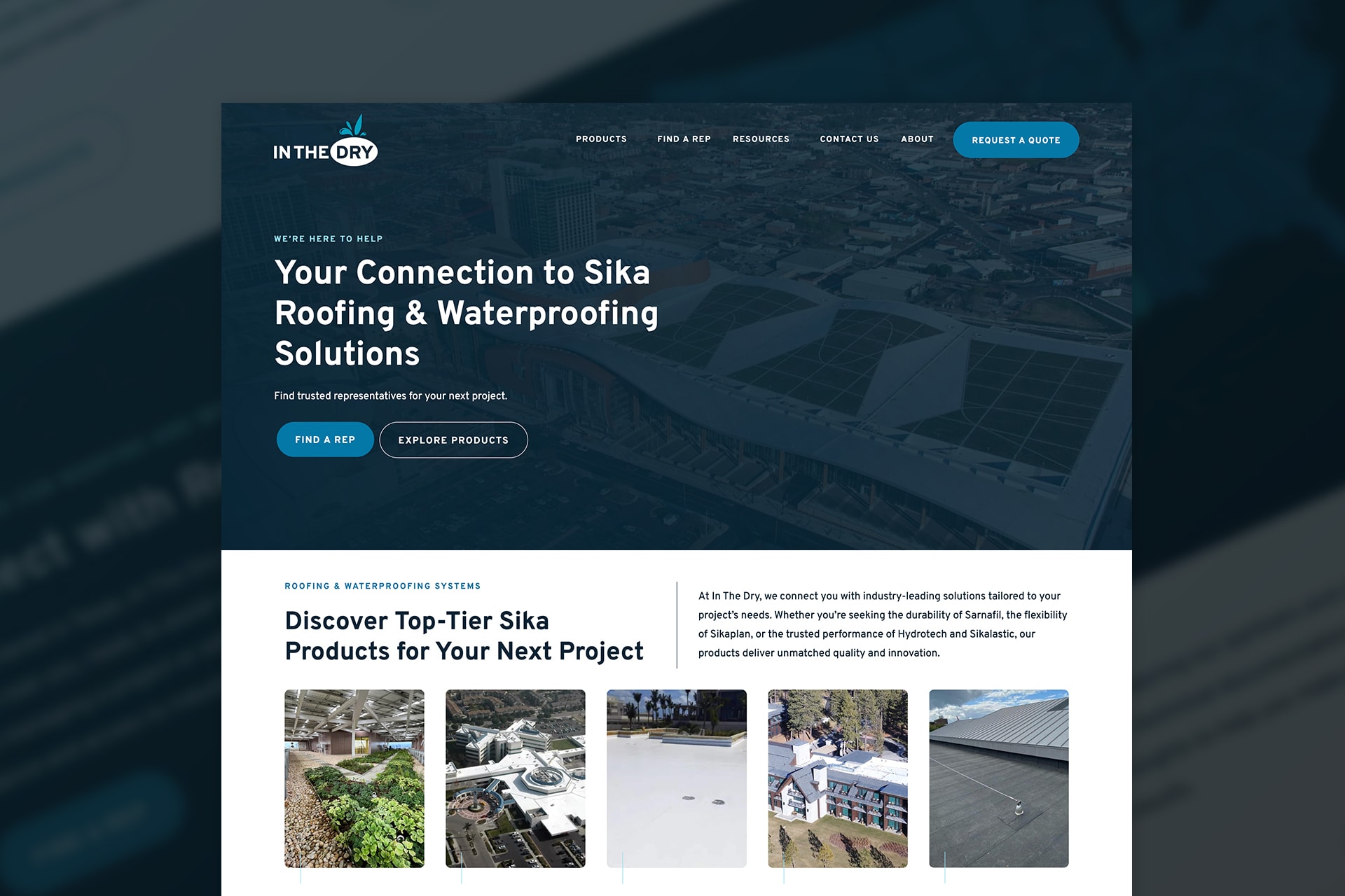
In The Dry had an established brand for several years, however, it lacked a strong foundation. The website was minimal and didn’t clearly communicate the company’s services, product offerings, or the value propositions behind them. Key information was either missing or unclear, making it difficult for visitors to understand what the company did or how its solutions stood out compared to competitors.
The former website only included a handful of project photos and case studies, offering limited insight into past work. The logo was overly complex and lacked scalability, and wasn’t conducive for applications like branded apparel or promotional materials.
Project Scope
- Branding
- Logo Design
- Print Materials
- Web Design
- WordPress Development
- Copywriting
Website
Objective
Execute a complete rebrand—refresh the visual identity, create a new logo and design system, and implement across all marketing materials. Create customer-centric messaging that clearly communicates the ability to match the right solutions for their target audiences.
The project began with a focus on branding, starting with logo exploration. We developed three distinct concepts with different creative directions, all unified by common themes of protection, durability, and performance. These ideas reflected the brand’s core purpose: to keep people and property dry and secure—much like an umbrella.
Ultimately, the final logo direction circled back to a motif inspired by the company’s original logo. The design was refined to include a rounded shape that subtly conveyed coverage and protection without being overly literal. From this foundation, we created a complete logo system: a minimalist icon version, a stylized version featuring raindrops (a nod to the original branding), and a full logo with a tagline designed for specific use cases.
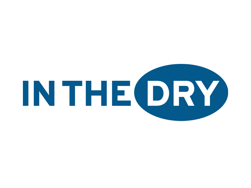
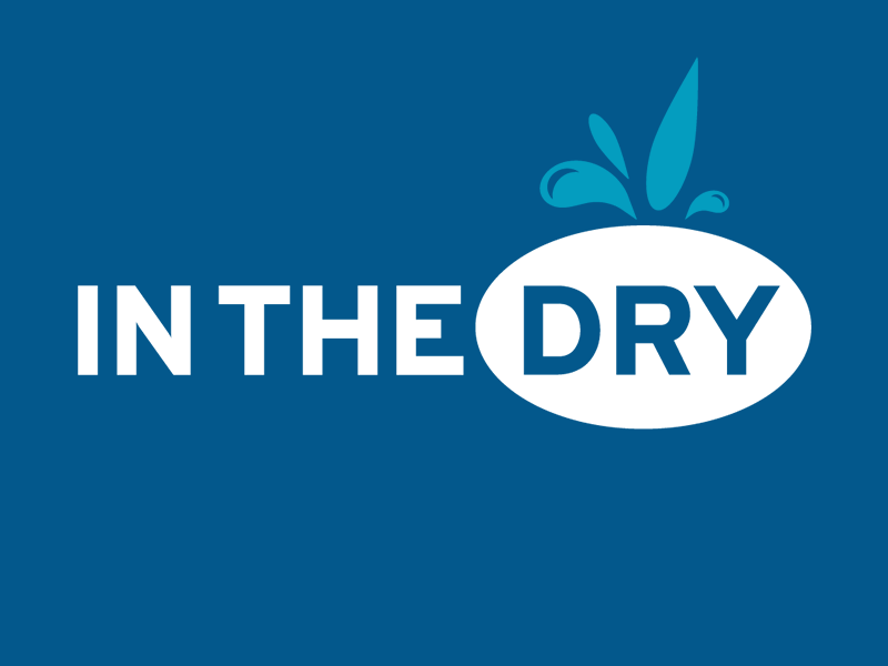
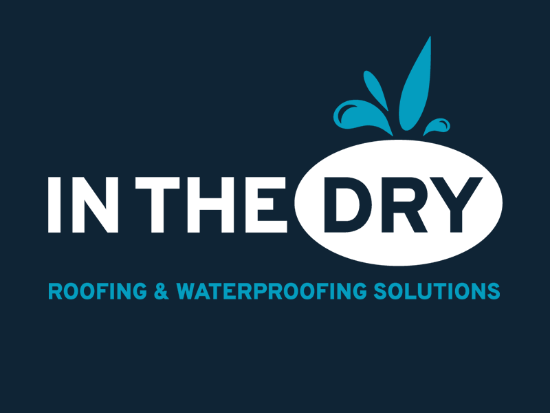
The visual identity continued with a new typography system for all marketing materials that is clean, sharp, and professional. The chosen typeface, Overpass, subtly conveys strength, durability, and long-term performance, aligning with the attributes of the company’s product offerings. The color palette leans into a natural association with waterproofing, using navy, teal, and a contrasting ice blue.
Once the branding system was completed, we moved into in-depth explorations of the product systems that the company offers in order to craft a content strategy for the website.
Through collaborative research, we gained a deep understanding of the advantages of each product system and how to present them to key audiences (architects, project managers, and building owners) in a clear and concise way that didn’t overwhelm users with technical jargon.
The content strategy mirrored the experience of speaking with a knowledgeable sales rep: solution-focused, approachable, and tailored to each audience’s needs. While technical details are available, the emphasis of the website is to help visitors quickly understand which product systems would best serve their specific projects.
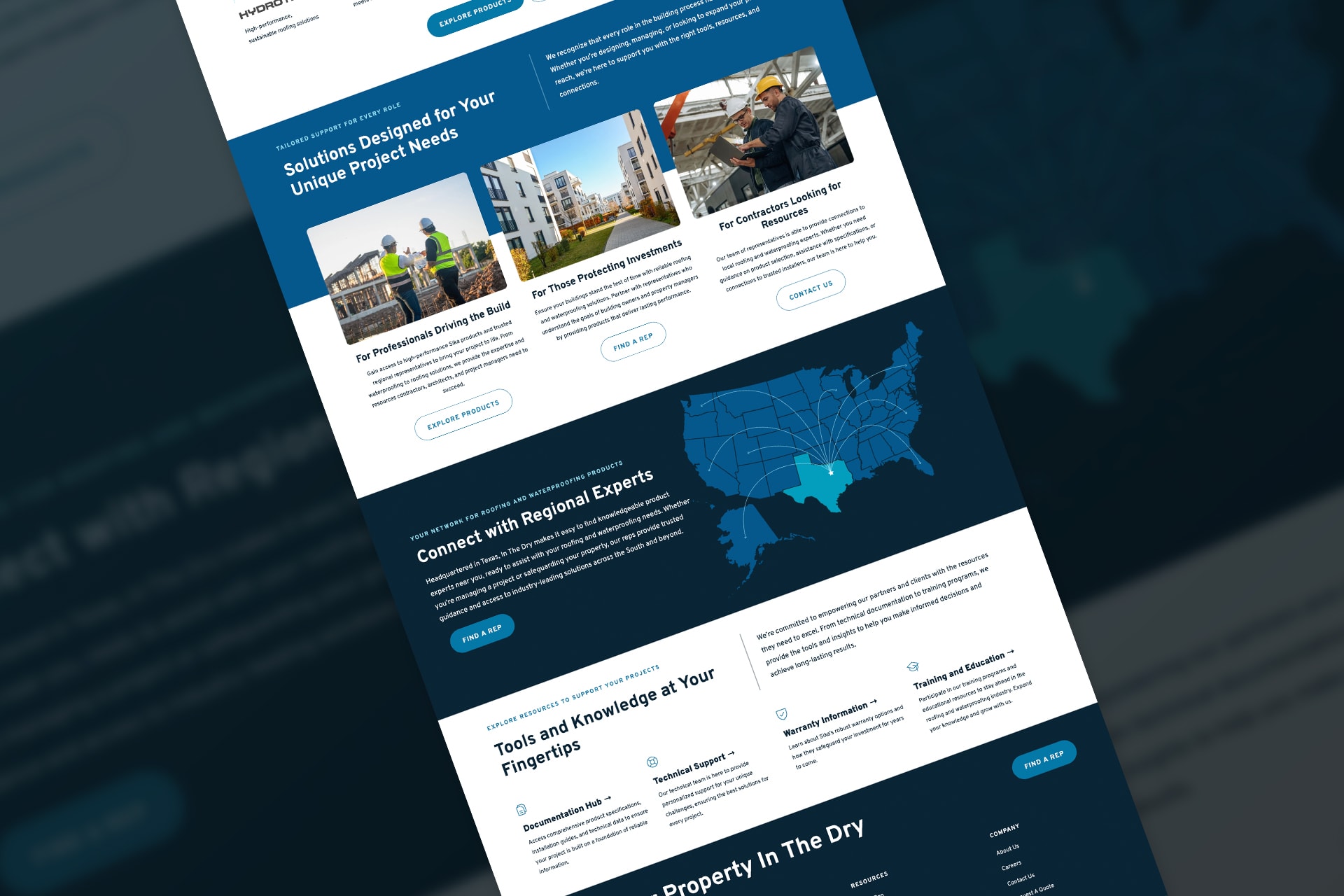
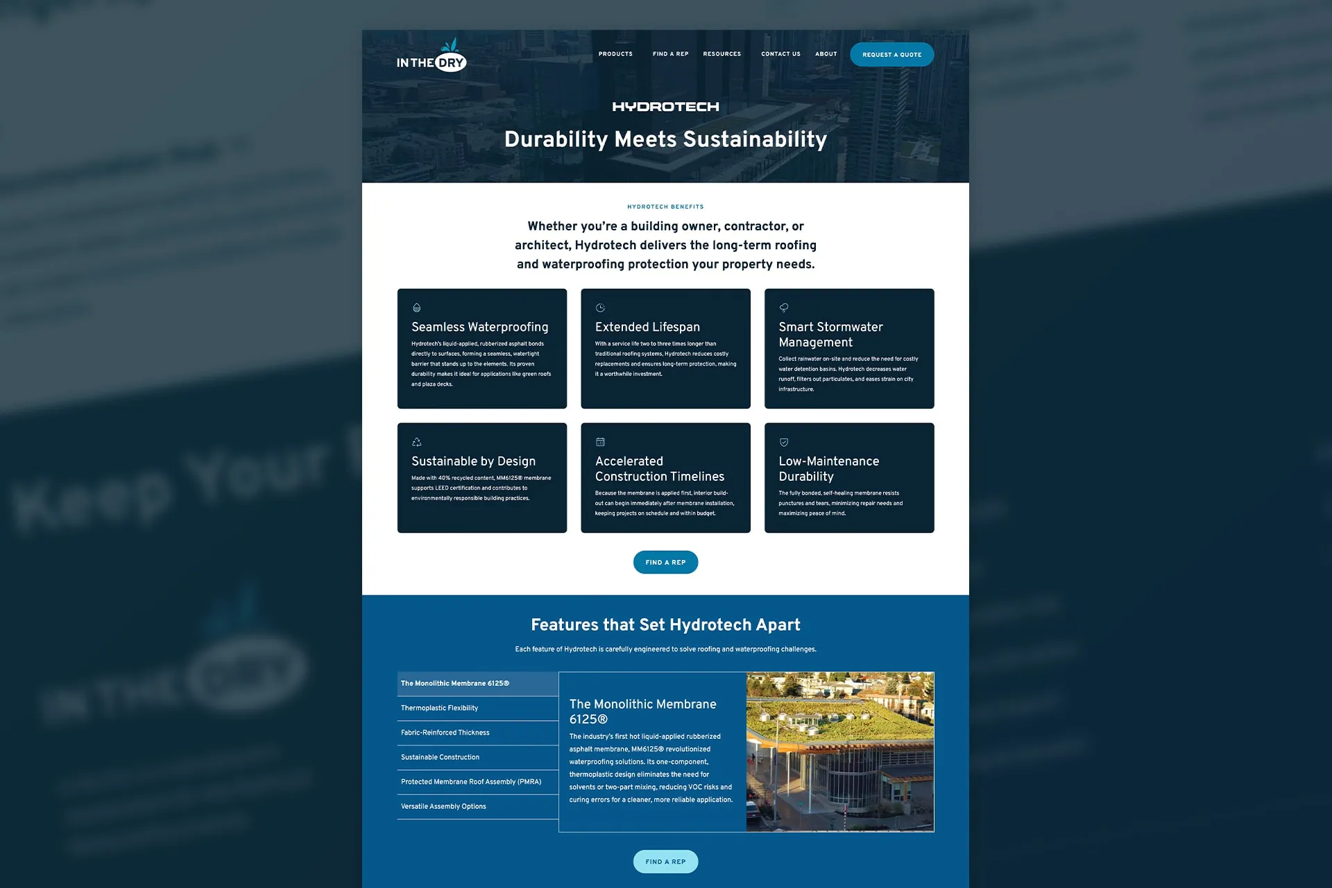
Following the successful website launch, we expanded the brand system with print collateral and ongoing brand support across multiple touchpoints, ensuring consistent implementation that strengthens brand recognition in both digital and physical spaces.
The rack card serves dual purposes in In The Dry's marketing strategy: a quick product overview and a functional note card for customer interactions. We designed the front with a glossy finish for visual impact, while the matte back allows reps and clients to write contact details and notes.
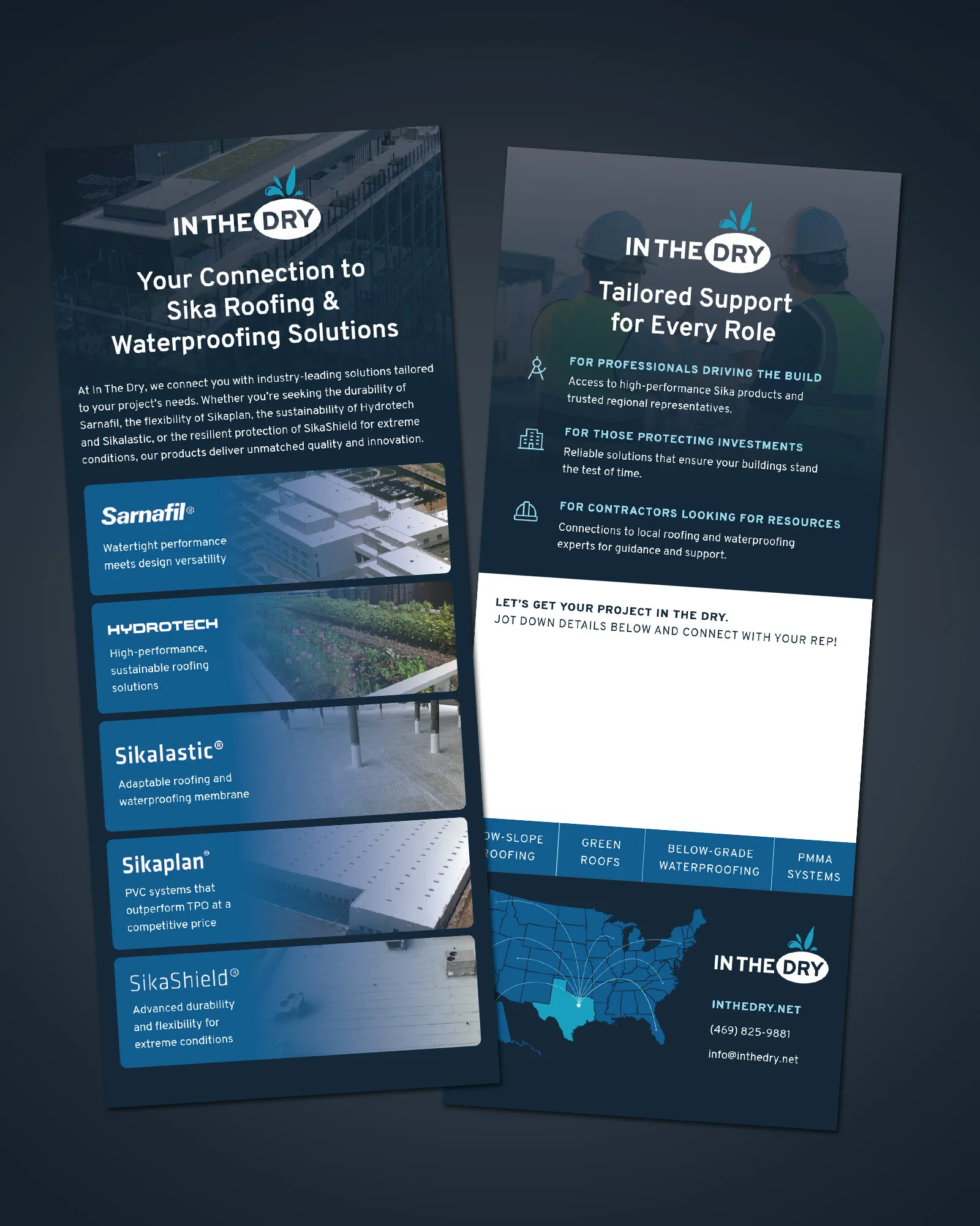
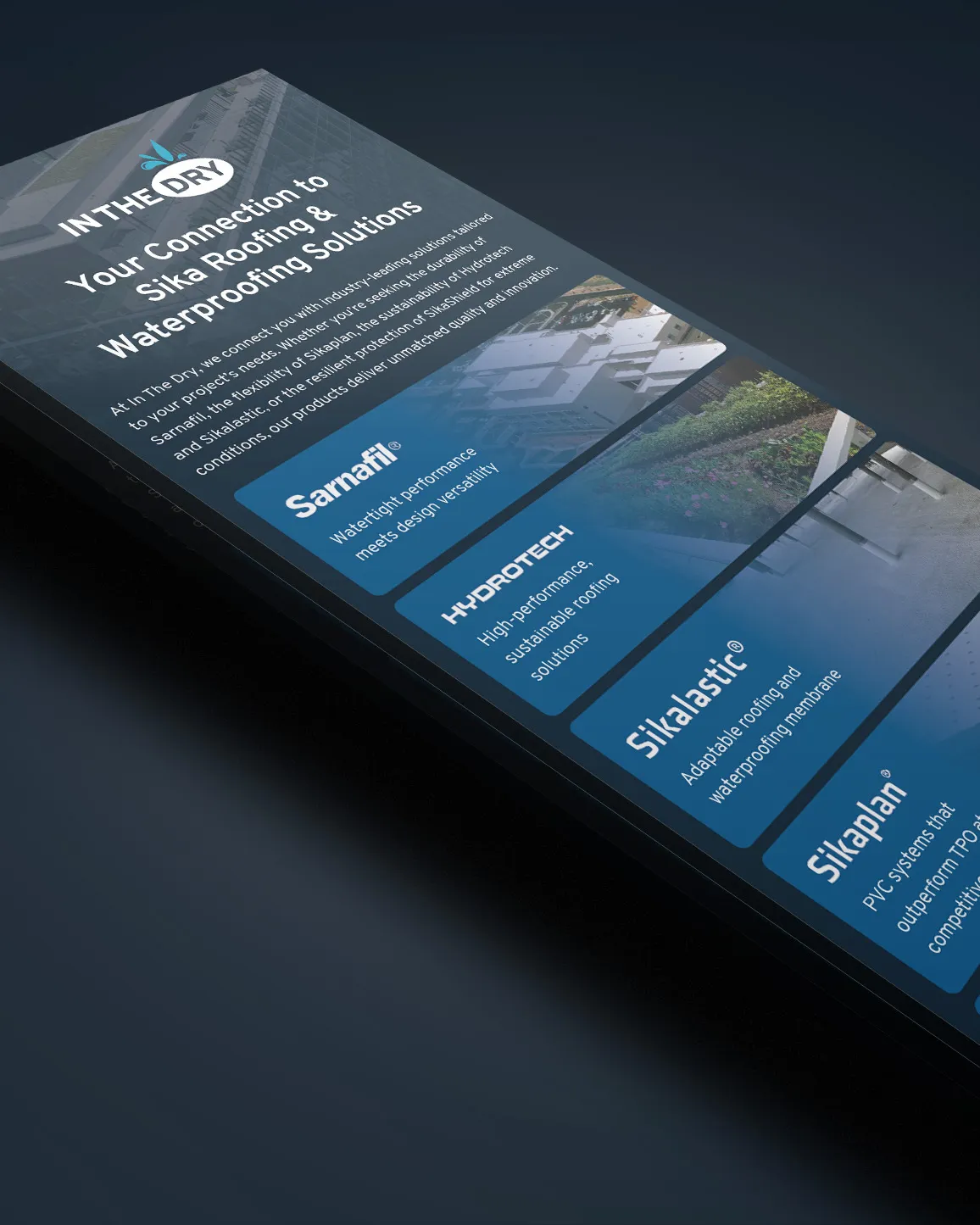
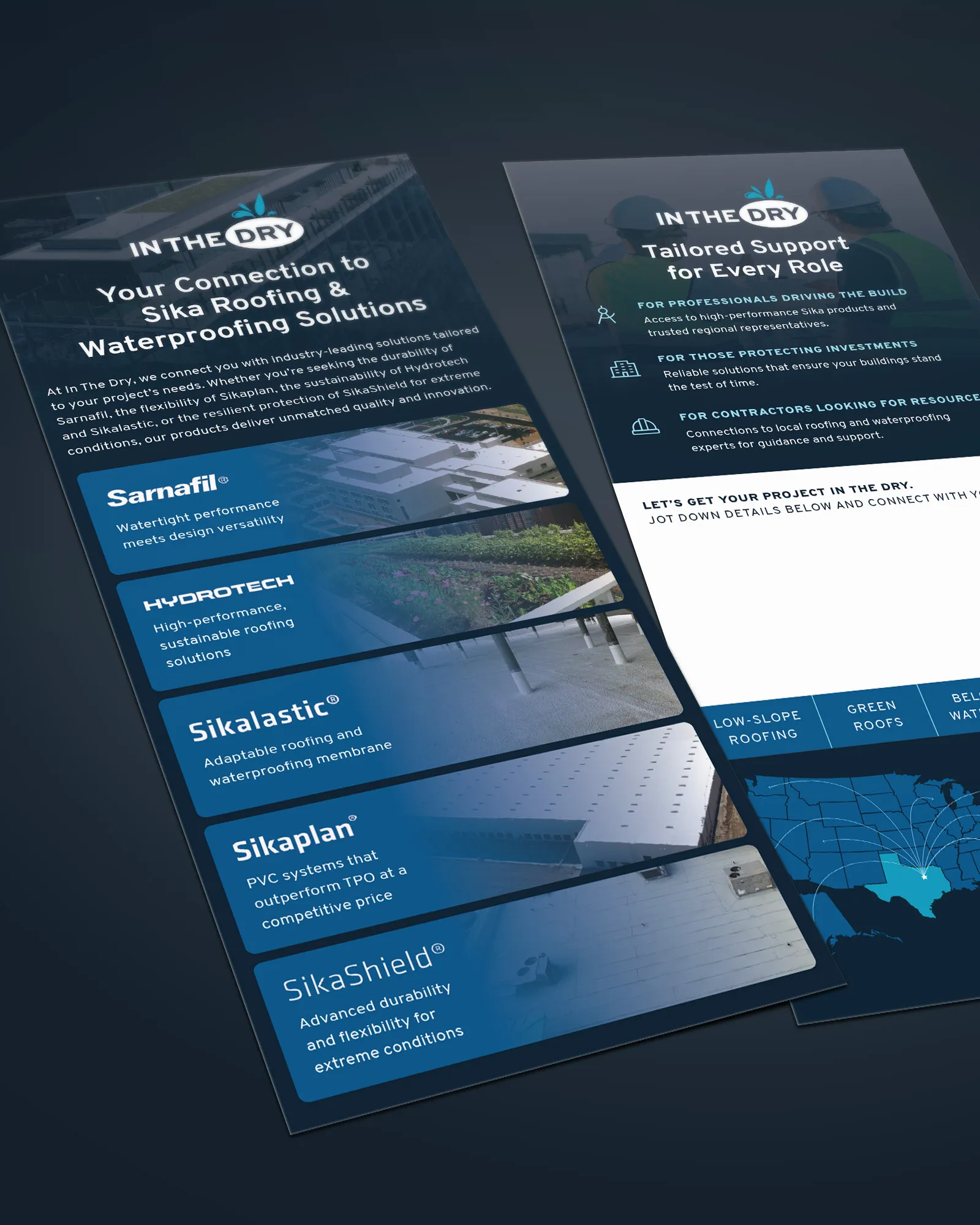
Overall, developing the new visual language, redesigning the logo, and implementing the final identity into a cohesive marketing suite was an extremely rewarding journey. The close collaboration with In The Dry leadership throughout the entire process ensured that the final outcome aligned closely with their original vision—resulting in a refined, professional brand and website that will support the company’s growth for years to come.
