Studio News
How Three Pool Balls Inspired Our Website Overhaul
By Mary-Ann Zykin
Published January 9, 2026

I am so excited to share the new website with the world. This website overhaul has honestly been a long time coming—really, since the initial launch of the Zykin Design brand!
The first iteration of the site was very black-and-white, keeping things minimal and clean. It was fine. But fine is not good enough for a design studio, and it’s been weighing on me since the very beginning. Over the past year and half, I kept my eyes peeled, my mind open to any spark of inspiration. I noticed the trends in the design world, and noted that I didn’t want to just follow along with what everyone else was doing. I was stuck.
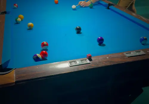
One day last summer, my husband and I were playing pool at a local pool hall, Bogie’s, where the vibe is cozy and the tables are plentiful. During one of our games, a trio of solids were sitting near each other in such a way that I was just completely fixated—the solid red, blue, and yellow ball just looked so visually appealing. I loved how vibrant it was, how lively and fresh it felt. Ever since that day, I’ve been completely fixed on that red—the way the light was hitting it though, the red was more of a red-orange, and every time I encountered the color elsewhere, I was just so struck by it.
I filed away the inspiration, hoping to use the color scheme on a client project, but it wasn’t really a good fit for any recent projects. When it came time to really dedicate the effort to overhauling our site at the end of 2025, it was a no-brainer to use the color scheme I’ve been so enamored with as the brand’s new colors.
Having a range of colors at our disposal means we have a ton of flexibility. My idea is to use the different colors as service pillars—paprika for branding, gold for graphic design, neon blue for web, and so on. This will give each pillar its own distinct feel, and prevents the otherwise wordy website from being too monotonous. Plus, the new color scheme just feels more like me.

The font family was the next piece of the visual puzzle. I’m so tired of grotesque sans-serifs, and serifs are too stuffy for the type of personality I want to exude. I spent hours scouring through my font library, Google Fonts, and Adobe Fonts, and nothing really fit the vibe of what I’m going for.
So I went back to my roots—when I first became a designer, I was obsessed with slab serifs and monospaced fonts. However, those tend to either have a lot of personality, or have some readability issues, so they can be a tricky fit for a professional brand. But I had stumbled upon the branding for Made In after getting a new wok for Christmas, and I loved the incorporation of a pseudo-monospaced font in their materials. I dug through their website’s source code to find the typeface, and tracked it down to a foundry that I’d never heard of before—Dinamo. I trialed basically all of their fonts, and ultimately landed on Marfa. The typeface has similar characteristics to certain monospaced fonts that I love, but has the readability of a solid sans-serif font without being the same sans-serif font that we see across pretty much every brand.
Now, let’s get into the written content for a moment. There’s quite a bit more words on the site now, and that’s completely intentional. I pretty much went through the exact same discovery process that I go through with clients. I took a journalistic approach, answering the questions: what do we do, who are our target clients, when in a client’s marketing or business journey do we engage on projects, where we are located and what our service area is, why we do what we do, and how our approach helps us deliver large-agency caliber work. Then, I expanded on each individual service pillar specifically, going through the same questions and positioning each service in such a way that explains to a business owner or marketing manager what they can expect when they work with us.
Given how much written content I produced and wanted to incorporate on the website, I had to figure out a way to present it without just completely overwhelming visitors with huge walls of text. I experimented with some of my common motifs, like tiles, bento boxes, solid backgrounds, and gradients, but none of these really fit the bill. And then I thought about the dividers themselves—why limit myself to just a straight, horizontal line? Why not give it a little bit of character, and reinforce the personality of boldness, confidence, and vibrance that the new color scheme supports? Thus, the curved divider was born.
Overall, I am very proud of version 2 of the Zykin Design website, and I’m very excited to get it out into the world and start driving traffic to it. Honestly, I had almost felt embarrassed by the old site because I didn’t think it reflected the quality of work that we do—which is something that my clients often come to me needing help with! But now, I have a site that actually reflects the vision that was lurking in the recesses of my mind, but I just had to find the right inspiration to uncover it.

About the Author
Mary-Ann is the founder, designer, and developer at Zykin Design, blending strategy and design for businesses across the US. She holds a BFA in Visual Communication Design and has over a decade of experience in both print and web design.